Delve Magazine
Print, Type/Layout, Art Direction, Branding
Overview: Delve is a magazine for the scientifically curious about what we do not yet have answers for in the natural and anthropological world.
Timeframe: 12 weeks
Client: School Project
Collaborators: Solo
Roles: art director, visual designer, branding
Tools: InDesign, Illustrator, Photoshop, Procreate
Skills: micro typography, photo editing, illustration, layout, art direction, time management, branding, copy editing


Audience
Delve aims to provide a widely accessible resource for the scientifically curious at heart that appeals to teens and adults alike.
After determining the general concept for Delve, I created a set of personas that each represent a key type of user that it caters to.
With these personas in mind, I was able to further inform the artistic and visual direction to best represent Delve’s mission and appeal to our readers’ needs.


Process
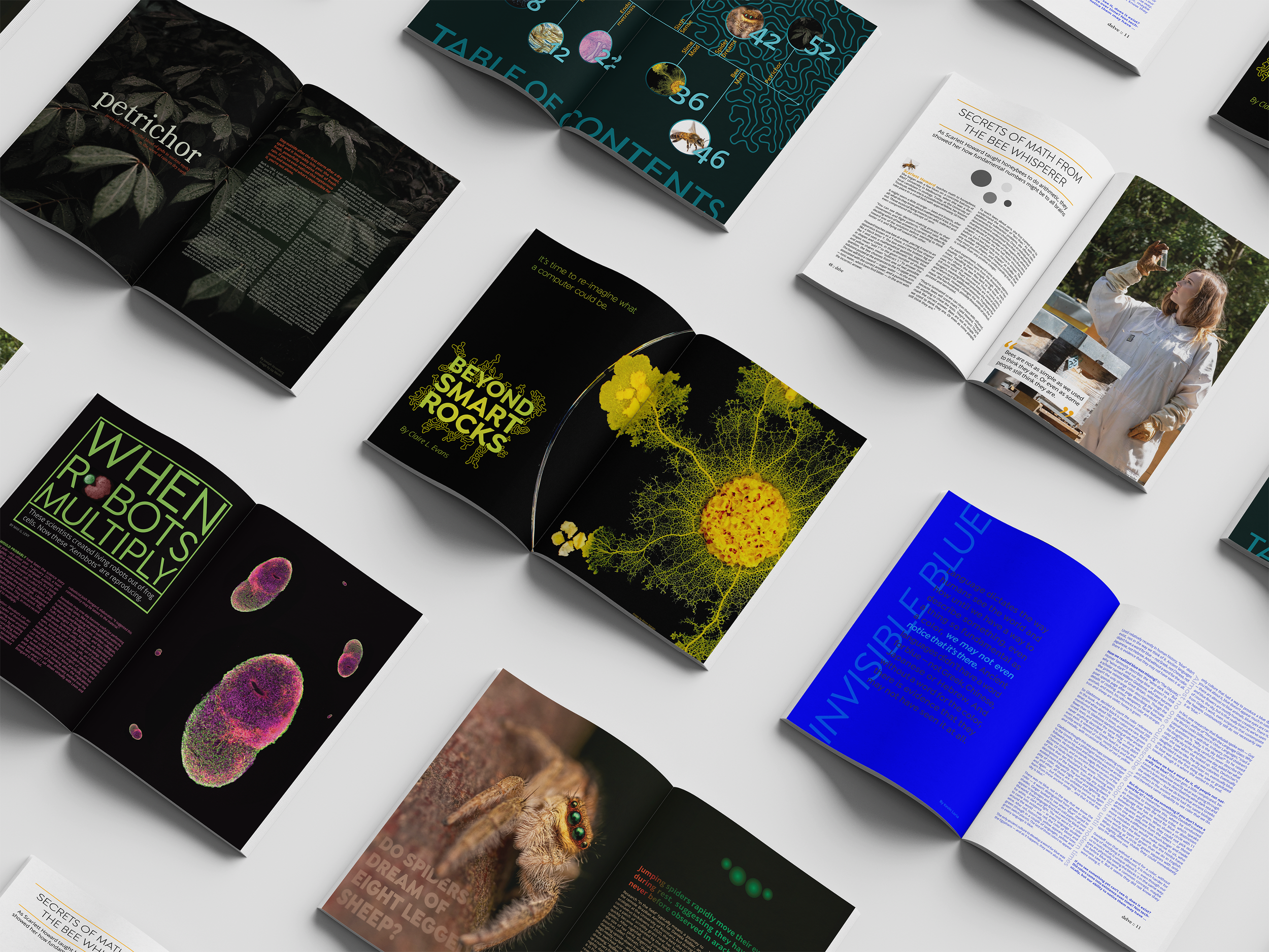
After determining Delve’s readers’ needs and conducting a competitor analysis of other popular science based publications, I was able to determine who we are and are not as a brand as reflected in our layout, type, color, and photography directions.
I chose Isadora Sans for my headlines and Open Sans for my body. These highly legible fonts each reflect the more modern and approachable nature of our brand while maintaining an air of trustworthiness that will appeal to older and younger readers alike.
Delve’s brand colors invoke a deep, underwater mood suggesting a progression into the unknown with golden yellow serving as an accent and call to attention. The reoccurring organic pattern illustration used throughout the publication and brand is a multifaceted reference to natural and scientific imagery.
Based on Delve’s readers’ chosen forms of media, I determined an article layout formula that emphasized bold, eye-catching imagery and opening spreads which lead way to content and information-heavy articles.

Word Mark Development
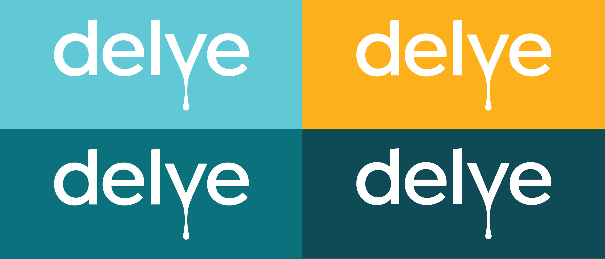
I sought to create a wordmark for Delve that would visually represent the concept of a “deep dive” exploration into unanswered and unknown science.
The simplified sans serif typographic base conveys trendy yet trustworthy, and by extending the vertex of the “v”, there is a suggestion of venturing out beyond what is expected.
This extension also serves as a visual parallel to the organic growth-like patterns and embellishments incorporated throughout the brand and imagery of the magazine. The gradated brand color application further suggests a physical movement into something deeper.


