Green Lake Park
Design System, Wayfinding, Environmental Graphics
Overview: Green Lake Park has been deeply cherished by Seattle residents for decades with its history marked by noteworthy events and remarkable innovations.
This environmental redesign seeks to improve the park’s dated assets to create a cohesive and accessible system of signage, wayfinding, and environmental art while reflecting on what makes the park a cherished landmark.
Timeframe: 11 weeks
Client: School Project
Collaborators: Solo
Roles: environmental graphic design, wayfinding, iconography, typography, visual design
Tools: Adobe Suite: InDesign, Photoshop, Illustrator; Procreate

Why a Redesign?
In recent times, Green Lake Park has experienced a decline in its relevance and upkeep, rendering it outdated and neglected. It no longer fulfills its previous role as a vibrant venue for events and a thriving community space.
The park has received minimal attention in terms of repairs and updates, while its existing navigation and regulatory systems are in dire need of reassessment. To address these shortcomings, a comprehensive redesign is necessary to align the park with the preferences of contemporary visitors, enhance navigation, and elevate its overall visual appeal.
Solution
I have developed a comprehensive system that addresses the needs of contemporary park visitors, enhances navigation and reinforces the significance of Green Lake and its historical legacy within the broader identity of Seattle.
This endeavor involved leveraging established iconographic conventions, employing legible typography with generous x-heights, and curating a color palette that harmonizes with the park's surroundings while ensuring visibility and distinctiveness.
The wayfinding map I have crafted draws inspiration from prominent historical landmarks encircling the lake. To further elevate the park's status, these landmarks have been enriched with captivating public art installations that symbolize various official emblems of the City of Seattle and the region at large.
Through this integration of art and symbols, Green Lake Park emerges as a powerful symbol in its own right, representing the essence of the city and its distinctive character.
Research
Demographic:
The demographic of Green Lake Park in Seattle, Washington, can vary and is not limited to a specific group. Green Lake Park is a popular recreational area that attracts a diverse range of visitors, including residents from nearby neighborhoods, families, tourists, fitness enthusiasts, and individuals seeking outdoor activities.
Accessibility:
The current signage in the park suffers from poor visibility, as it is often concealed within the surrounding scenery or positioned at improper sight lines, either too high or too low. Additionally, the park's map lacks a clear visual hierarchy, resulting in confusion and difficulties in navigating the area.
The absence of a well-defined traffic structure along the lakeside path leads to hazardous situations, with pedestrians, runners, and cyclists weaving unpredictably among each other.
In light of these issues, a holistic approach is required to rejuvenate Green Lake Park and ensure it meets the expectations of modern visitors.
Iconography
The iconography I developed is based on the SEGD recreation symbol set used by the National Parks Department. Minor customizations were made to better reflect the specific features of Green Lake Park.
Sign headings are set to one inch (72pt) tall for every 10 feet of the sign’s intended viewing distance.
Signage
In order to improve upon the park’s current signage system, I created a family of signs that match stylistically and use a consistent iconographic system.
The color application in these signs serves to non-disruptively complement the scenery while avoiding blending in so well that they are no longer noticeable. They follow comfortable pedestrian sight lines relative to each sign’s dimensions and intended viewing distance using the industry standard of a 6ft sight model.
Wayfinding
To enhance wayfinding and improve usability, the map has been divided into distinct color-coded and landmark-defined regions. This strategic segmentation facilitates easier navigation and orientation within the park.
Each section on the map corresponds to a specific public art installation, represented by unique icons that signify their respective locations along the lake.
The icon system, which I have carefully developed, serves as a practical key for swiftly identifying points of interest on the map. Additionally, the typography has been scaled to ensure legibility even from a considerable distance, enhancing overall visibility and readability.
Family of Signs
I divided the map into color and landmark regions to aid in wayfinding and usability. Each section corresponds with a historical landmark paired with a public art piece representing a symbol of Seattle.
I maintained some of the existing rules of the traffic flow directions along the path but modified them slightly to make them more clear. I did this by utilizing an established convention of the same green used to mark bike lanes on city streets to indicate the path for wheels. I then made a rule indicating separate directions for foot travel and wheel travel in order to prevent collisions and injuries.
Example of a regulatory sign strategically placed in various points around the path.
Multiple signs are used to indicate the directional flows of both the foot and wheel paths. Wheels have one-way status while pedestrians can travel from any direction. Sign placement is determined by the direction traveled along the path.
This sign is one of three in a series of landmarks and public art around the park. Each one incorporates the official symbols of the City of Seattle to further establish Green Lake Park as essential to the identity of Seattle as well as give a bit of historical context. This point of interest highlights the history of the Children’s Wading Pool as well as the official bird of Seattle, the great blue heron.
This point of interest highlights the features and history of Evan's Pool and Community Center and showcases the official flower of Seattle, the dahlia, along with native pollinator hummingbird species.
This point of interest highlights the history of the Aqua Theater’s famous past performances as well as showcases the Douglas fir paying homage to the region’s iconic trees.
Public Art
The park’s wayfinding is based on a series of three landmark regions around the lake. These landmarks incorporate the official symbols of the City of Seattle in the form of public artworks paired with one of the Historical markers to further establish Green Lake Park as essential to the identity of the city.
Children’s Wading Pool
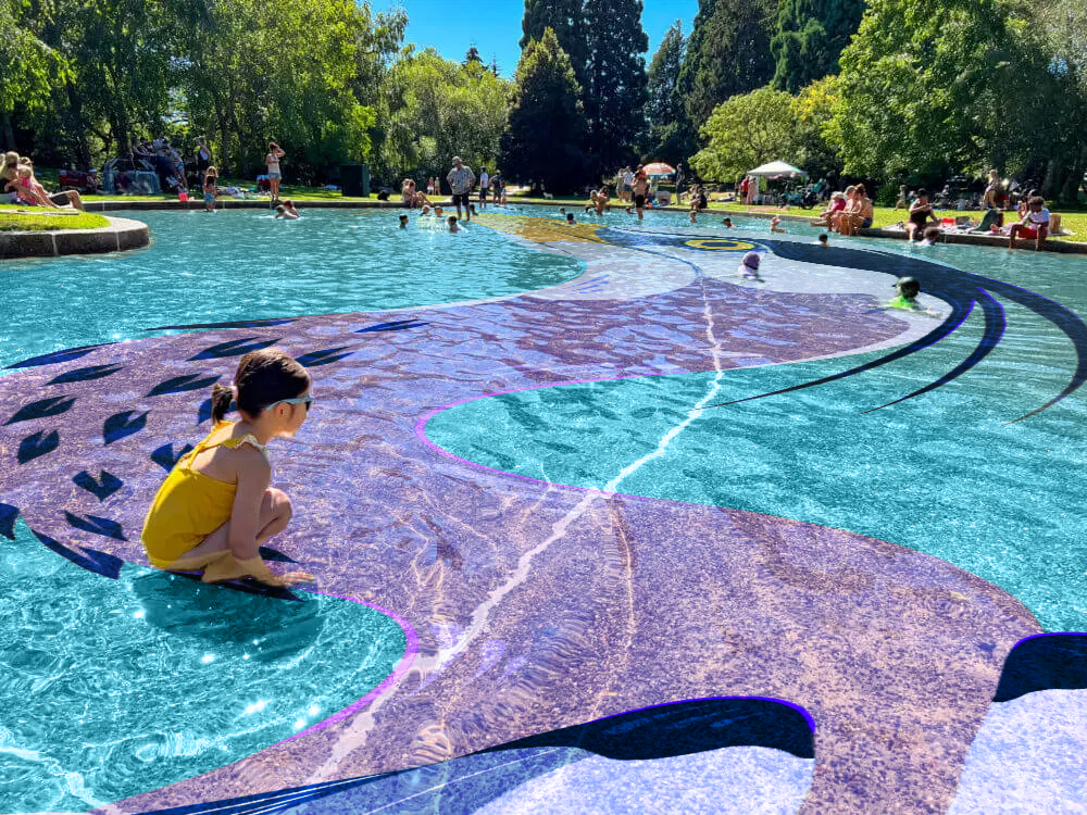
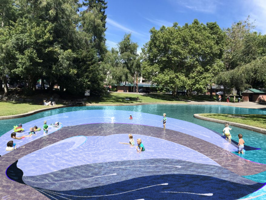
The great blue heron, recognized as the official city bird of Seattle and commonly found in abundance around the lake, holds a significant presence in this public art and placemaking endeavor. The primary objective of this artistic intervention is to infuse vibrant color and dynamic motion into the typically monotonous concrete setting of the Children's Wading Pool.
The artwork extends seamlessly from the public art piece to the placemaking element, thereby reinforcing the overall visual narrative. Through skillful manipulation of heron imagery, the artwork invites viewers to experience a captivating sense of scale, while the vibrant blue hues surrounding the bird evoke the radiant skies of Seattle's summertime.
This landmark is represented on the map as the Heron North, light blue region.
Mural Materials: weather and waterproof outdoor mural paint Dimensions: 235 ft long x 71 ft at widest point


Placemaking
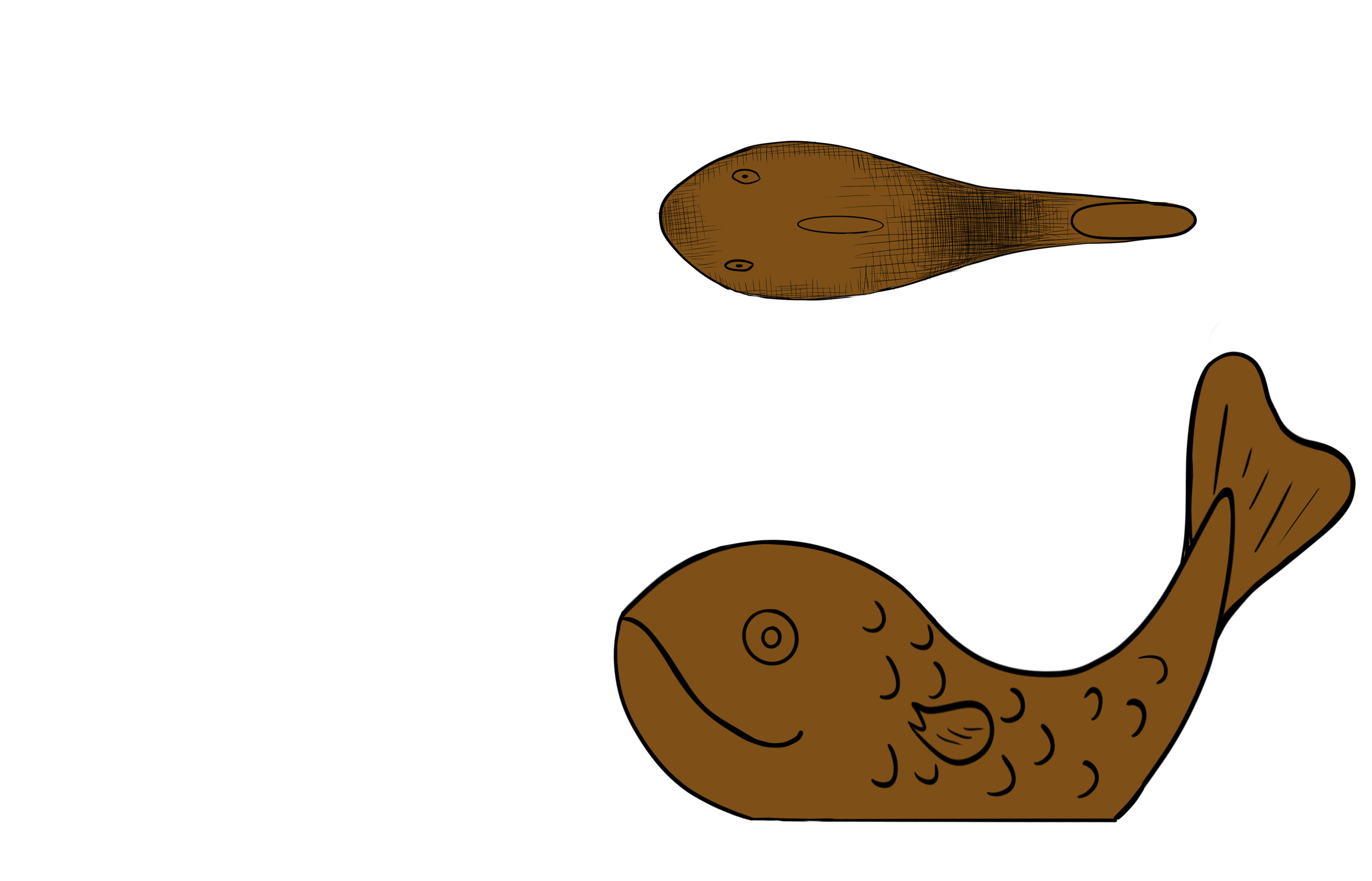
The Wading Pool Heron Mural extends towards three bronze fish sculptures, which serve multiple functions as benches, play elements, and enticing subjects for photography.
These fish sculptures also playfully manipulate perspective and scale, immersing viewers in the point of view of the swimming fish as they appear to elude the wading blue heron's pursuit.
Bench Materials: bronze
Dimensions: 17.7” (to seat) x 35” (tallest point) x 72” (long) x 29” (deep)


Evan’s Pool and Community Center
The dahlia, designated as the official city flower of Seattle, holds particular significance within the artwork. These vibrant flowers reach their peak bloom in August and can be observed adorning numerous parks across the city, including Green Lake.
Notably, dahlia flowers play a vital role in attracting essential pollinators such as hummingbirds, butterflies, bees, and moths to the area, fostering a thriving ecosystem within the park.
This landmark is represented on the map as the Dahlia South, golden yellow region.
Materials: Outdoor Wall Paint
Dimensions: 14’ x 23’


Takeaway
Green Lake Park, cherished by Seattleites for decades, has experienced neglect and outdated infrastructure. It no longer serves as the vibrant community space it once was, with limited repairs and outdated navigation systems in desperate need of reassessment.
A redesign is imperative to reflect the needs of current park visitors, enhance navigation, and improve the park’s overall aesthetic appeal.
Inadequate signage and a lack of traffic structure along the path have created hazardous conditions, with pedestrians, runners, and cyclists navigating through a congested and confusing environment.
It is time to rekindle Seattleites’ appreciation for Green Lake Park and its historical significance. The proposed design solution encompasses enhanced signage, engaging public art, and symbolic landmarks to restore the park’s identity as a cherished community space.


