Neko Cat Cafe
Branding, Logo Design, Web Design, Layout/Type
Overview: Rebrand of Neko Cat Cafe
Timeframe: 11 weeks
Client: School Project
Collaborators: Solo
Roles: Branding, Photo Editing, Illustration, Web design, Research
Tools: Adobe Suite: InDesign, Photoshop, Illustrator, AfterEffects. Figma. Procreate
Challenge
Neko’s current logo and branding could use a more clear direction. The primary logo doesn't seem to match the same playful and often tongue-in-cheek presence and persona the business has cultivated online and within its merchandising.
Solution
The business would benefit from an updated rebrand to keep up with how it has evolved within the community since it first opened. My goal is to build upon and reflect more of Neko’s most public-facing identity of trendy playfulness that does not take itself too seriously.
Research
I began my process by researching Neko Cat Cafe. I aimed to find out who they are, what their values are, where they began, and what they are known for.
Neko Cat Cafe was founded by Caitlin Unsell and her partner Cory in 2017 and has locations in Seattle and Bellingham. The cafe provides a fun and inviting space that fosters community and helps frequently overlooked for adoption, FELV+ cats find forever homes.
They sell coffee, kombucha, wine, beer, sake, and small nibbles to enjoy while interacting with the cats or just chatting with your friends at the bar. They also have extensive merchandise featuring their logo and taglines as well as their permanent resident cats.
Their social media presence is incredibly cute, cheeky, and effective at raising their resident cats to online celebrity status with nearly 100k followers on Instagram and 335k followers on TikTok.
Audience
Neko Cat Cafe is for cat lovers, people looking to adopt a new cat, animal enthusiasts, and those looking for a unique and relaxing experience.
Their secondary customer base is comprised mainly of local families — Seattle parents wanting to do a fun activity with their kids on a rainy day or anyone who visits the neighborhood and happens to wander into the charming and intriguing storefront.
Concept
I began the discovery of Neko’s brand concept through a series of image and word association exercises to determine the brand’s tonal range.
In this part of the process, I worked with three other people who were conducting their own rebrands of Neko Cat Cafe. By collaborating on our project brief and tonal definitions, we were able to best consistently define Neko’s core brand traits.
Tonal Development
We began with an image bank which we then sorted into categories representing what we are, what we are not, and everything in between through dot voting. We then stated how the images related until we formed an associated word bank that we were able to categorize.
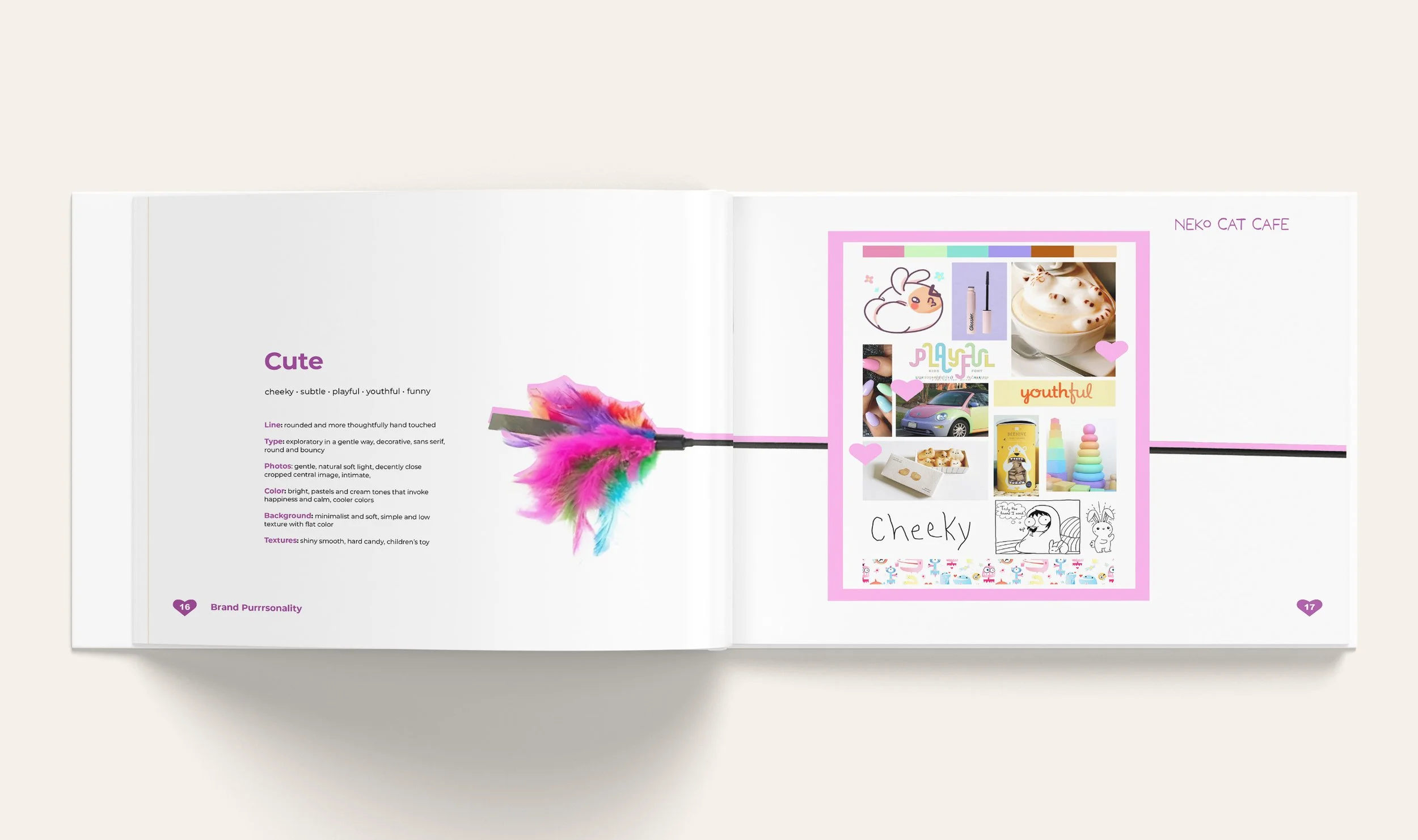
From here, we determined our three primary tonal associations to be friendly, cute, and unique.
We used these tonal territories along with Neko’s unique characteristics to define the following positioning statement that would go on to inform our mission statements and brand promise.
“For the local cat enthusiast, Neko cafe is a cozy place that has friendly cats, fun, knowledgeable staff, and offers snacks, coffee, and adult beverages. Our brand is chosen because we specialize in finding homes for hard-to-adopt cats while creating a welcoming community.”
From this point, we split off and continued through the project on our own.
I used these territories and their supporting descriptors to create the concept statement, “Cat-titude” with an accompanied visual board using a tonal formula of 75% unique, 15% cute, and 10% friendly.
This concept visual board was curated using images from our original brainstorming session as well as some new supporting imagery to create a distilled representation of Neko’s Cat Cafe’s “Cat-titude”. This concept board became the guiding star for the brand’s development and applications.
Bright colors inspired by cat toys reflect our primary demographic of young adults who value individuality.The colors are named after the permanent resident cats and are based on their unique traits and personalities. These traits determine their placement and use throughout the brand.
Logo
The logo is an expression of the brand’s identity. An approachable and handwritten style wordmark conveys the friendliness of Neko’s personality, while the rounded shapes and large eyes of the brandmark capture its cute, playful nature.
The strategically placed, wavering line treatment adds touches of energetic and offbeat qualities to emphasize the unique approach of the brand.
Development
I started with a series of brainstorming sketches to work through a stream of consciousness of ideas and eliminate more predictable solutions.
From there, I conducted wordmark sprints that consisted of experimenting with over 180 different fonts to determine what best defined the brand’s concept.
I landed on the Adobe font Moon Blossom. I then modified the font to customize it to the brand’s aesthetic and used the “O” as the determining shape of the cat eyes on the brandmark.
I then experimented in various lockups to create my combination mark in a scalable format.


Final Design
Deliverables
Creating a cohesive brand identity for Neko Cat Cafe required designing brand touchpoints spanning interactive, environmental, and print mediums. Color signifiers became one of the defining features to express the various unique personalities that the brand encapsulates. A library of illustrated assets and photography treatments were also key in maintaining a cohesive brand presence across mediums.
Print Applications
To-go bag, coffee cup, loyalty card


Merchandise
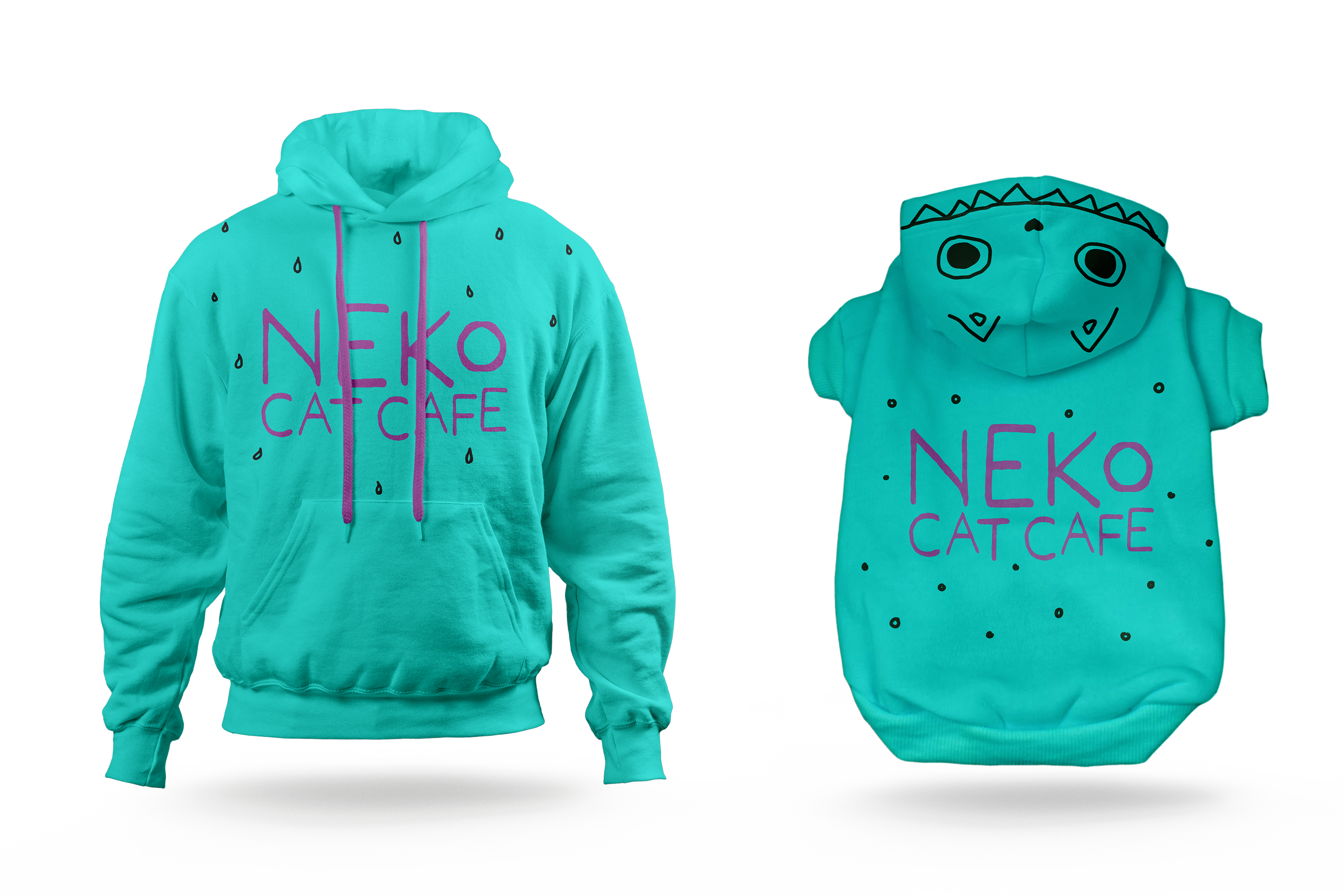
Tote Bag, Kitty and Me Sweatshirts, Kitty Bow-tie


Environmental Application
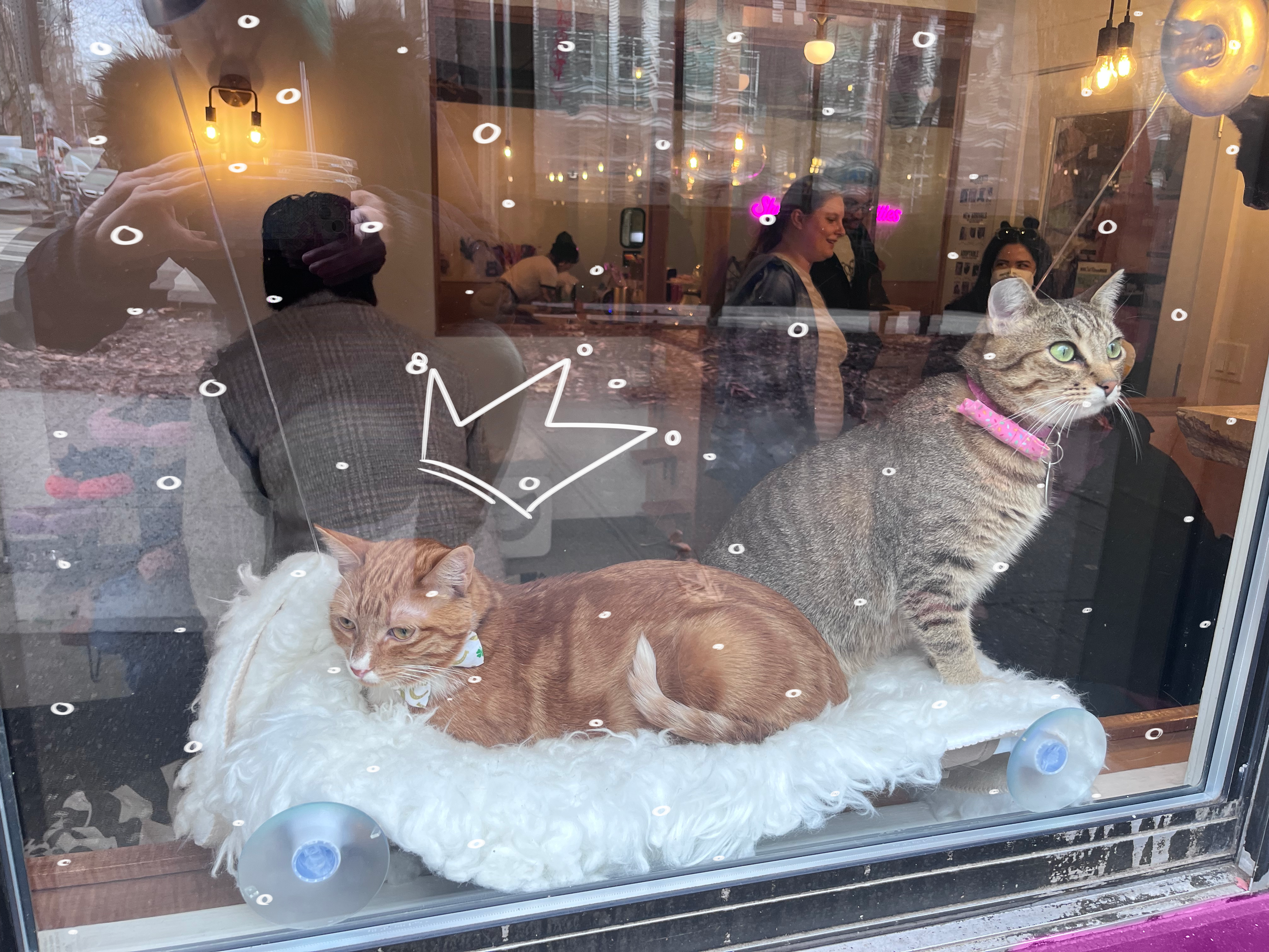
Outdoor Wall Decals, Window Decals


Animated Promotional Logo
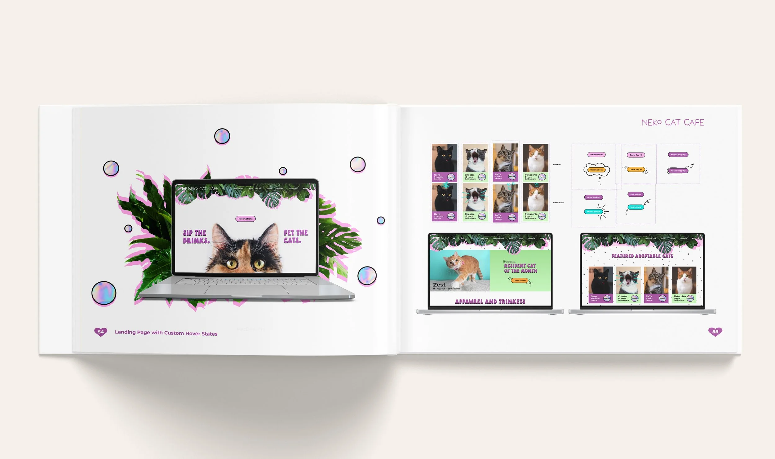
Website Home Page
Brand Style Guide Book
Takeaways
I initially struggled to know when and how to apply my brand assets, however, the website’s home page application is the moment when the entire brand concept came together for me. Once I had established that footing, it was much easier to apply the brand components to various other mediums. It was much like an actor realizing and getting into their character. Applying this analogy and thought process has become invaluable as a method of approach when working on other branding projects, and has allowed me to portray with consistency the essence of a given brand.


